DRamSrt10
Full Access Member
I really like Srtbrad's ideas of #2 on back of t-shirt and #1 on front of t-shirt AND the #1 on hat. :rock:
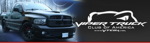
Dominick572 said:I Voted for ROZ's, personally I like this one. I think It seperates us from the vipers, and focuses us more on the truck. Its pretty simple too...
") What do you want to see? :rock::rock:
What do you want to see? :rock::rock:Roz-SRT said:I'm always open to some contructive criticism.:rock:
First off, lemme start by explaining my "simple" design. Previously stated in the orginal thread, a design was requested for use as embroidery for shirts, and for stickers to be made. This is the reason for staying away from something "photographic". Granted I've never done embroidery, but I have had decals made. 9/10, decals are on placed on glass and have to endure the elements. I know a guy who does vinyl signs for a living and he tells me that your multicolor/screenprint type designs look best when first printed, but after exposed to some elements, eventually "wear" with the times. So I went with something "not to complicated" and something that could be easily embroidered and produced into stickers. I just did as requested? :dontknow:
If a we're wanting a new internet banner, my design would be HIDEOUS!
I can go back to the drawing board, and maybe next go 'round include all submissions and hold a vote again, instead of narrowing it down to two.
Those that dislike either design, speak up!
Roz-SRT said:Thanks Brad! Define "busier" for me. Tell me exactly what you want to see different?
Just so everyone knows, no offense is taken by anyone not liking the design.
When I preliminary stages of designing folks a log home, I rarely get it right the first time. It takes some communication back and forth and eventually it gets right!
FlyingLow said:I voted for the wrong one. Change my vote to #2.
Dominick572 said:I Voted for ROZ's, personally I like this one. I think It seperates us from the vipers, and focuses us more on the truck. Its pretty simple too...