thank you for looking out for me,it is kind of you.:rock:Kevan said:It's cool. I just didn't want you to get into trouble.

You are using an out of date browser. It may not display this or other websites correctly.
You should upgrade or use an alternative browser.
You should upgrade or use an alternative browser.
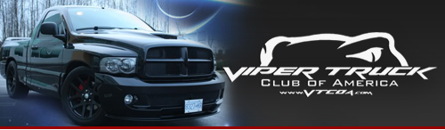
~!@//---Official VTCOA Logo Contest--\\~!@
- Thread starter RedSrt007
- Start date
More ideas and variations. Lets hear some input/suggestions. I will throw out some more whenever I get a few more spare moments. Lets hear some ideas, they should be kept simple for ease of production. I honestly have no idea how to have these made other than me printing these and taking them to a sign shop and let them scan and cut them. Someone else probably has a better source than I.
Brat, nice avatar! Enjoy it.
Brat, nice avatar! Enjoy it.
kalani
Full Access Member
gotsmarts idea is great - i love the 3/4 view design of the grill and lights with the fangs inthe lights - nice work!!!
Maybee the design could incorporate a few small flags across the bottom, or in the bold black border ie USA, australia, and other nations as we have members from all over the globe (as sickness said).
Maybee the design could incorporate a few small flags across the bottom, or in the bold black border ie USA, australia, and other nations as we have members from all over the globe (as sickness said).
Last edited:
kalani said:gotsmarts idea is great - i love the 3/4 view design of the grill and lights with the fangs inthe lights - nice work!!!
Maybee the design could incorporate a few small flags across the bottom, or in the bold black border ie USA, australia, and other nations as we have members from all over the globe (as sickness said).
I agree, it is a sweet idea! I fed off of someone saying it was too cartoonish and ran with it.
I see what I can do, I'm open for any suggestions. This logo is for EVERYONE. Thanks for the input!
iwantmysrt said:More ideas and variations. Lets hear some input/suggestions. I will throw out some more whenever I get a few more spare moments. Lets hear some ideas, they should be kept simple for ease of production. I honestly have no idea how to have these made other than me printing these and taking them to a sign shop and let them scan and cut them. Someone else probably has a better source than I.
Brat, nice avatar! Enjoy it.
i like it also for the back window???? but on the V and the K at the end add some fangs? my 2 pennies guys?
thank you mr.iwantmysrt for allowing me to use it for my avatar.
The one that Brat has as an Avatar is AWESOME
bro your designs just keep getting better.
That's pretty sweet!
What would it look like if he had a truck in his fangs? Or maybe even the name: SRT-10
What would it look like if he had a truck in his fangs? Or maybe even the name: SRT-10
or maybe mikey.ntw0rk said:That's pretty sweet!
What would it look like if he had a truck in his fangs? Or maybe even the name: SRT-10

gotsmart
New Member
I did some refinements to the version i posted before, and simplified it down to a pair of one-colour applications that could easily be made into cut vinyl decals in black, white, silver or chrome.
There's a "positive" version for use on light colours, and a "negative version" for use on darker colours like black and red.


There's still a bit of work to do if this identity is chosen, but it's getting close.
There's a "positive" version for use on light colours, and a "negative version" for use on darker colours like black and red.
There's still a bit of work to do if this identity is chosen, but it's getting close.
moparracing
Full Access Member
iwantmysrt said:Brat, you're welcome. Thanks for any and all compliments. Here is another submission. I've got a few more idea, but this is just the latest.
changed my mind....... like this one the best, so far......
AZ Viper
Full Access Member
Yup, this looks good.
sweet i like the thinner version
Kevan
Full Access Member
Just curious if a vote is going to happen, of if this is dead in the water.
RedSrt007
Active Member
Kevan said:Just curious if a vote is going to happen, of if this is dead in the water.
1st week of Jan..
FSTJACK
Full Access Member
There are so many good ideas and designs that have been posted it is unreal. Thanks guys.
Just a couple of thoughts from an old marketing guy...Design needs to be effective and comprehensible in large and small formats...it needs to say who and what we are, it needs to provide identity, differentiation and most of all be easily recognizable...too much detail will get lost at distance, or in small formats.
Personally, I feel it needs to provide access or reference to the site for those who don't know about us and want to explore our strange but loving world.
Now if someone can execute all of those things and make 1000 members happy we will have something!
I also advise that the decision should be in the hands of the owners. At one time I was in a huge organization and we took suggestions on names for a new product then had the employees vote on the name...the outcome was a poor name that did not do what management wanted, and we had a few hundred happy employees and a few thousand disappointed and unhappy ones...
Love the chance to input...but the owners need to satisfy their desires and be sure the logo type does what it needs to do...and we members need to understand the issues involved in this design issue.
Support Us
Become A Supporting Member Today!