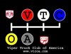
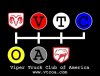
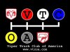
~!@//---Official VTCOA Logo Contest--\\~!@

Prof said:
Just a couple of thoughts from an old marketing guy...Design needs to be effective and comprehensible in large and small formats...it needs to say who and what we are, it needs to provide identity, differentiation and most of all be easily recognizable...too much detail will get lost at distance, or in small formats.

Personally, I feel it needs to provide access or reference to the site for those who don't know about us and want to explore our strange but loving world.

Now if someone can execute all of those things and make 1000 members happy we will have something!

I also advise that the decision should be in the hands of the owners. At one time I was in a huge organization and we took suggestions on names for a new product then had the employees vote on the name...the outcome was a poor name that did not do what management wanted, and we had a few hundred happy employees and a few thousand disappointed and unhappy ones...

Love the chance to input...but the owners need to satisfy their desires and be sure the logo type does what it needs to do...and we members need to understand the issues involved in this design issue.

I totally agree. Owners need to call this one.

J.R.
 
Prof said:
Just a couple of thoughts from an old marketing guy...Design needs to be effective and comprehensible in large and small formats...it needs to say who and what we are, it needs to provide identity, differentiation and most of all be easily recognizable...too much detail will get lost at distance, or in small formats.

Personally, I feel it needs to provide access or reference to the site for those who don't know about us and want to explore our strange but loving world.

Now if someone can execute all of those things and make 1000 members happy we will have something!

I also advise that the decision should be in the hands of the owners. At one time I was in a huge organization and we took suggestions on names for a new product then had the employees vote on the name...the outcome was a poor name that did not do what management wanted, and we had a few hundred happy employees and a few thousand disappointed and unhappy ones...

Love the chance to input...but the owners need to satisfy their desires and be sure the logo type does what it needs to do...and we members need to understand the issues involved in this design issue.

Best input yet! I too do SOME marketing, its not my forte. I tried to take all those things into consideration. I agree though, it should be in the owners' hands.

Do I have enough time to draw up a few more concepts? When is the "deadline"?
 
first time ive seen this thread .. im sure we can come up with something better than the previous posted .. .. something that looks a lil more profesional.. thats for sure
 
submission

Guys

This is my first submission for the vtcoa logo. This is not a final image. It needs to be cleaned up a bit. Also, the font is pretty lame. I am willing to take recommendations on font. I have 2 other ideas that I am mocking up as well.
 

Attachments

  • logo_sm.jpg
    logo_sm.jpg
    19.2 KB · Views: 43
Let me ask the "Power's That Be" this. Are you wanting a new banner for the site? Or something more "2D" that can be printed onto T-shirts and made into stickers and such. I thought we wanted something more along the lines of the later.

Again, here are all my submissions: Maybe more to come, after I get a little insight on which direction to go. . .

vtcoalogo.jpg

vtcoalogo-Model001.jpg

vtcoalogo-Model002.jpg

vtcoalogo-Model003.jpg

vtcoalogohead.jpg

vtcoalogo3.jpg
 
if it were up for a vote i would vote for your designs,they look great.
 
Thanks man.:rock: Personally, I like the very last one, Sneaky Pete's eyes above the VTCOA link. I think it works best for embroidery and for stickers. I guess only time will tell! Thanks again man!
 
iwantmysrt said:
Thanks man.:rock: Personally, I like the very last one, Sneaky Pete's eyes above the VTCOA link. I think it works best for embroidery and for stickers. I guess only time will tell! Thanks again man!
yeah that would look good on the back of a jacket.:D :D :rock: :rock:
 
update

I just cleaned up the scale and positioning of some of the elements. Otherwise it is the same. I don't think this concept is formal enough to be the logo for the orginization. I think it would look cool on a t-shirt though.
 

Attachments

  • logo_sm.jpg
    logo_sm.jpg
    21.1 KB · Views: 45
Very slick, Cold!
I like it, esp. for a t-shirt. Could be put on the front pocket of a shirt too.
 
Some great creative being displayed...keep it up you artsy fartsy folks...we non-creative dolts are loving your efforts!

MORE, MORE, MORE!!!!
 
I think Brat has the best design. Check his avitar, It freakin :rock: :rock: :rock:
Come on lets get movin on this. ( or not ):D


J.R.
 
Yes, we do need to start wrapping this up so we can get them made in quantity. This is the last call for pics!

Thanks

Patrick
 
Just thought i'd bump these back up since it seems there's activity in this thread again.

vtcoa_idea_v3dw_white.jpg

vtcoa_idea_v3dw_red.jpg

vtcoa_idea_v3dw_black.jpg


There's still a bit of work to do if this identity is chosen, but it's getting close to what i've got in mind.
 
submissions

Added a submission
 

Attachments

  • zlogo_alt.jpg
    zlogo_alt.jpg
    17.6 KB · Views: 36
  • zlogo.jpg
    zlogo.jpg
    23.3 KB · Views: 29

Support Us

Become A Supporting Member Today!

Click Here For Details

Back
Top